

Ugly is in the ire of the beholder.
And uniformly, Todd Radom has a laundry list of targets he can reference when sorting out Major League Baseball’s history on this dirty subject.
The Houston Astros’ rainbow fade that Nolan Ryan was once made to wear after the Angels let him walk away. Check.
The White Sox’ of Chicago’s scandalous attire at different points in the ‘70s and ‘80s – collared shirts, short pants, license-plate “SOX” across their hat and shirt. Double check.
The San Diego Padres’ Taco Bell brown-and-yellow mess that Tony Gwynn embraced out of embarrassment. Check please.
Do not dry clean any of the arguments Radom makes in presenting cases for these — as well as address two other faux paus much closer to our Southern California home – with the release of his new book, “Winning Ugly: A Visual History of the Most Bizarre Baseball Uniforms Ever Worn” (Sports Publishing, 156 pages, $24.99, released May 15).

 “I come at it from this perspective,” Radom says, “and it’s a good thing to think about — I used to have a bulldog named Casey. He was stout white … ugly … bulldog. I’d be walking down the street with Casey and people would stop and say, ‘She’s so ugly … she’s cute … she’s beautiful.’
“There’s certainly nothing polarizing about ugly uniforms compared to the rest of our society talks about right now. The book has been a very positive experience so far and people seem very happy overall about it.”
We recently reviewed as one of the top choices for our 2018 edition of the 30 baseball books for the 30 days of April.
It has become more-than-fashionably popular since it started appearing on local bookstore shelves as Father’s Day nears.
Thus, we thought it suitable to call upon the New York-based Radom, a graduate of the School of Visual Arts in N.Y. and a graphic designer/sports branding expert who has worked with the MLB (specifically on the Angels’ brand) in shaping its messages, to see if he could button up some questions we have about where this is all trending:

Q: For starters, your website explains how you have some direct history in helping the Angels look the way they do today. There was a period when Disney had ownership of the team after Gene and Jackie Autry and tried a lot of combination of looks and colors – periwinkle, to be exact, is a somewhat horrible flash back. Can you explain much about what you did to help them evolve to what they are today?
A: In my 25 years of working with Major League Baseball, I can tell you that we worked with the Angels back in 2001 – Disney still owned the team but, as it worked out, that was soon to change. There was a whole movement at that time with professional teams starting to break away from what we can call the ‘excesses’ of the ‘90s as far as their visual look was concerned. Teams were going back to basics. So the Angels were kind of on the forefront of that movement. So first year with the new look, they win a World Series – again it’s always better to be lucky than good – and it’s had great staying power. Which can be unusual.
Q: Such a contrast to what Disney once tried out early in their ownership (1999, even though they effectively had control in ’96). Was Disney mirroring what other teams were experimenting with or really going off on their own in trying to trend-set with their marketing experience?
A: The Angels’ story of the late ‘90s really doesn’t happen if not for the marketing success of the (NHL expansion team) Mighty Ducks (founded by Disney in 1993). Right? For every action, there’s another reaction. When you think about the sports marketing and licensing landscape of the time, you had expansion teams in all sports breaking out and doing crazy stuff. The NBA (in 1995) had the Raptors (in Toronto) and Grizzles (in Vancouver before moving to Memphis) and it was an era of more is more, and the targeted consumer was a very young market. That came with a great deal of experimentation. Well, like any period of experimentation, the pendulum will usually swing back, and it’ll hit something that’s a little more timeless. I think that’s the gap I was filling with the Angels.
Q: Also, the Angels are competing for attention in this market with the Dodgers, a team that has had a very traditional, clean brand. The Dodgers’ script look, as you describe in the book, is a “visual cornerstone of the foundation,” and when they added the red numbers on the front in 1952, it was “a touch that represented the final brushstroke of a baseball masterpiece.” Yet there was even a time when the Dodgers, under the Fox ownership in the early ‘90s, tried to experiment as well, coming out with an all-blue top one time in 1999 and people went a little crazy. There’s the two-page photo spread in the book (pages 112-113) that illustrate the time when both the Dodgers and Angels had a lapse in judgement on their uniforms, and capped off by a game when Chan Ho Park and Tim Belcher get into an odd fight, it’s our contention that they were both upset having to wear those uniforms.
A: As a New Yorker, it’s really no different than the dynamic that exists between the Yankees and Mets. If the Dodgers and Yankees are Coca-Cola, then the Angels and Mets are Pepsi. Right? There’s old money-new money dynamic in play. For the Dodgers to have worn blue for those handful of games (in ’99), that’s as far as they went to break away from the quintessential baseball look. If you close your eyes and dream up what a baseball uniform should look like, it’s the Dodgers, and add to that having been kissed by the beautiful clarity of that Southern California sun that makes them whiter and brighter.
Q: As you point out, and maybe many didn’t know, the Dodgers’ look does have some alterations over time – including 1971, when they tried to add a blue stripe to the road uniforms, but then that goes away quickly. They tried a satin power blue look in 1944 so that it glistened under the new night lighted fields.
A: You know that you owe the Dodgers’ current look to Larry MacPhail, who came in as general manager and vice president in 1939, and transitioned the team from its Kelly green look at the time. He’s a Hall of Famer, and innovator, and someone who understood branding and marketing a time when that was not professionalized to say the least. He commissioned the Yankees’ logo for their hat when he was with that team. The Dodgers really don’t have a lot of license other than paint around the edges, and they really shouldn’t.
Q: You also explain in a blog post how the red number on the front was an idea by owner Walter O’Malley to address the advent of televised games so viewers could see numbers on both front and back.
A: When you think about the size of those numbers as well, it may have only decreased recently, but they are huge compared to the Mets or White Sox or most other clubs. This is where form and function come together that transcends just the idea of, ah, let’s just put it on there.
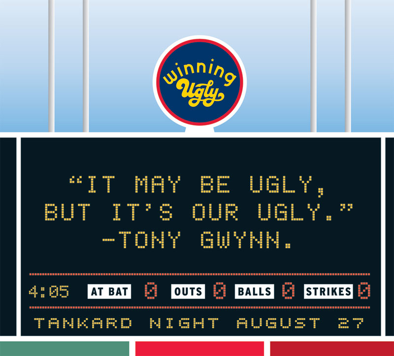
Q: And then you have the San Diego Padres, who have gone through so many strange ideas for uniforms since they came about in 1969 – and they’ve seemed to embrace their old Taco Bell uniform look so where when they have Turn Back the Clock games, the fans seem to enjoy the ugliness of that time period. Was that Taco Bell uniform one of your top five worst if you were to rank them?
A: Without question, and for a couple of reasons. The color scheme is unique to them – and unique doesn’t always mean good. There’s the quote from Tony Gwynn I wanted to include about how it ‘it’s our ugly.’ But the Padres changed uniforms constantly in the ‘70s, a series of one-and-out looks. It’s interesting to point out that in San Diego, just as it is in Philadelphia where they had the swirly P look for a time with the power blue, you’ve got a generation of people who never saw these things play regularly because they weren’t born yet. The Padres broke away from that brown color in maybe ’91. The fans still clamor for that look, but to imagine a stadium filled with that brown, that’s a tough thing to think about.
Q: You define the golden age of the ugly uniform era as being from 1972 to 1986, and you also make the really interesting point that with Ronald Regan coming into office as the president in 1980, he may have set the tone all over to go more conservative look that permeated all through society. Was that really such a huge shifting point in baseball uniform history?
A: When you think about the dynamics happening in our country at that time – wild experimentation with what people were wearing. And by ’86 and ’87, it’s the era of Wall Street, a back to basics with suits and suspenders. Money is back in and counter culturalism is out. I think that correlation is no accident.
Q: So then last August, we had what we were told was the “Players’ Weekend,” so the Dodgers and Yankees are made to wear these softball-looking pullover uniforms with nicknames on the back. I don’t know if you were involved in that whole thing – and if you were, shame on you – but …
A: I was not! As you said, the first time in their history, the Yankees wear pullovers with their names on the back. But here’s the way I thought about it. I’ll give you a moment in time that relates perfectly to this. You can see throughout the book, there are simulated illustrations of jerseys, and I got them from a collector. So on that particular day in late August, I’m at his house in the suburbs of Philadelphia and shot those photos for the book. And on the TV in the background, all of this Players’ Weekend was going on (laughing). My thought: the baseball season is so long, we can have some room for experimentation and for some fun and expression of individuality. But I don’t know if I’d want to see it 162 games a year.
Q: We’ll finally get to this question: From your personal standpoint, what’s your favorite ugly uniform?
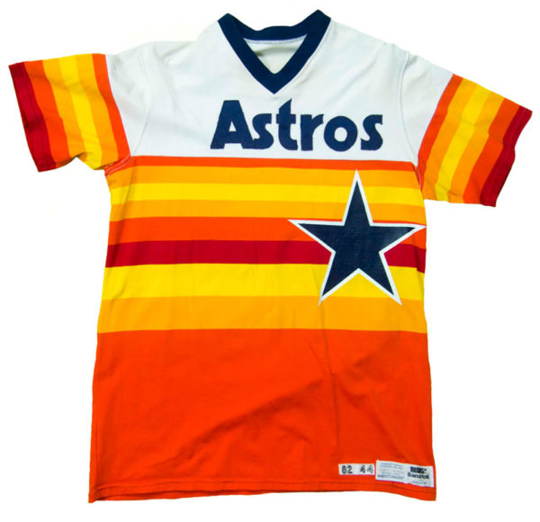
A: I have to take the total copout and say it’s the Astros’ rainbow look (1975-86, described in various ways, including ‘Tequlia Sunrise’). It’s like the iconic – to use an overused word – thing of its generation. It was so audacious. IN doing what I do, every team should reflect where they play. For the Houston of the ‘70s, of that place and of that time, showed such chutzpa – no one looks like that, and nobody ever looked like that.
 Q: And then making Nolan Ryan have that on his portfolio. Maybe it was done to make his fastball look even tougher to pick up coming out of so many shades of orange.
A: Originally, they were supposed to feature a white star on the front instead of a navy blue one that they settled on, because apparently there was some concern that white star might ‘hide a pitch’ from a pitcher. From Nolan Ryan, that could have made him even more unhittable.
Q: Are there any minor-league uniforms that you could take a dive into someday and pull out the ones that are, for lack of a better word, really ugly beyond creative? Isn’t that really the place where experimentation happens more often in baseball than on the major-league level?
A: That would be a never-ending subject. There are a lot of minor-league looks that are supposed to be ugly. Where is the accident and where is the intent? Where do you draw the line? Here’s a story. I did a panel discussion a few years ago that involved a major-league pitcher, who shall remain nameless. We were talking uniforms afterward, and he shows me a picture on his phone during a time he was in the minor leagues, and he’s wearing a SpongeBob SquarePants-designed uniform. Head to toe. He’s a professional athlete! The apex at his profession. And he was kind of laughing about it.
(Note: Here’s a story about the 2015 Norfolk Tides, the Baltimore Orioles’ Triple-A affiliate, wearing the SpongeBob jerseys)
Q: Minor league teams in Southern California can have nicknames like the Quakes and the Storm and the JetHawks and create logos and uniforms that go all over the spectrum of creative and cartoonish. But they are also very creative and might be dismissed.
A: I like the look of the Brooklyn Cyclones (New York Mets’ Single-A team) – starting with how they incorporated the old Brooklyn Dodgers’ “B.” It’s really a different animal – it’s a major-league look for a minor-league team in a major-league city. The challenge with the minor leagues is you’re selling the franchise not the players, who quickly come and go.
 Q: The Montreal Expos logo is also something you explain so well in the book that maybe hasn’t been explained before. The combination of trying to get the “E” incorporated into a script “M” with the red, white and blue … If another team ever returns to Montreal, wouldn’t they have to go back to this look because it’s so “Montreal” baseball?
A: Oh, I don’t know. I think maybe you have to respect the classics and go fresh. It’s a great city and a weird stadium. I went to one home game at Olympic Stadium in ’87 and the logo was great without question – it looks like it comes from a foreign country, even if they were very refined looking uniforms, even the racing-stripe versions. They never wore pullovers or belt-less paints. It was a pretty solid classic baseball look if you get past the weirdness of the logo.
 Q: If you want to get sidetracked here, the Las Vegas Golden Knights’ season would have been a success if only based on the sales of their logo-based shirts, hats and jerseys. If you get a popular logo, some people in Vegas might not even know it’s associated with a team, but just like the look of it and want to sport it.
A: It’s so interesting, clearly, as an experiment having hockey in the desert, plus the success they’ve enjoyed … So I think of these kind of things in three-and five year chunks and you project forward. Sometimes people fall out of love with an expansion team after awhile, but the Golden Knights’ story is such a storybook thing that has legs.
Q: Some quick hits on stories in the news: The MLB decided it had to enforce some rules in place about its uniform guidelines when it was pointed out that some players wanted to have all black shoes, or another was wearing something on his sleeve that wasn’t conforming to the right color. How do you feel about that kind of thing when it comes to the MLB and teams trying to protect the integrity of their brand and look on a uniform versus players being allowed to do something on their own?
 A: I think like any rules, there has to be some discretion in applying them. Brand integrity and the dynamics of the relationship between the players’ association and Major League Baseball are entering into this. What I think: The uniform itself – jersey, cap, pants – are generally pretty sacrosanct. There’s room for some individuality with shoes and socks, but you don’t want them to clash in a way that denigrates the brand. If someone like Yoenis Cespedes wears a neon yellow sleeve, that’s going to clash with the blue and orange. But if you’re Ben Zobrist and you’re wearing all black shoes … it’s a neutral color and won’t overpower the look of the Cubs. Discretion is king when applying justice here.
Q: Advertisements on the uniforms are something we’ve heard about coming for some time. We see soccer jerseys with commercial brands all the time across their chests, but it’s still a distinct business logo. We now see NBA jerseys with smaller brand logos at the top. How will ads on jerseys eventually compromise what’s nice and what’s ugly?
A: First off all, from the perspective of someone who does what I do, anytime you put a logo next to another logo, it tends to chip away at both. That’s just a fact. So how you deal with it is very important. With the NBA, they broke the seal of the big four sports in the United States. What the NBA has done is subjugated the ads to a defined and consistent place on the jersey. For the MLB, it’s kind of inevitable, and I was saying that 10, 12 years ago. It’s already started with the World Baseball Classic. Things like this kind of infiltrate a way that seeps in rather than a giant wave. It’s not a wonderful thing from an aesthetics standpoint, but it really could be a lot worse.
Q: When that talk began years ago, we saw the Dodgers start to put the “LA” logo on their shoulder sleeve as a way to quietly introduce the space that a commercial brand could eventually go. One would think they’d have to consult and work with a graphic designer, like you, to make sure one brand or logo doesn’t denigrate the other and figure out a way for them to co-exist.
A: I deal with this every day. I’ve created the look of Ice Cube’s Big 3 league. They took on Adidas as a partner this year, so there is that logo on the uniforms, which is no big deal. But you also have to know when you put Adidas and Fox next to Big 3, it has to be in a sensitive way that maintains the hierarchy of all this and you maintain the core brand.
More to know:
 * Todd Radom’s website includes a store that has items for sale, including these two 11×17 inch posters for $60 each.
 * Follow Todd Radom on Twitter.
* Radom did a New York Times opinion piece in April, 2017 entitled “Why I Love Ugly Uniforms”

2 thoughts on “Sports and the media 05.25.18: A tailor-made approach to determining what’s ugly, what’s not and why we love laundry and its logos — a Q&A with “Winning Ugly” author Todd Radom”